AccuRoof
Rebranding SIG Design & Technology to AccuRoof
New regulations,
new positioning
new positioning
Post-Grenfell, the new Building Safety Act (BSA) introduced a more stringent regulatory framework for the built environment, massively impacting the way building and roofing systems are procured.
SIG Design & Technology had long established itself as the go-to roof design and supply provider for architects, specifiers, and lead contractors. But ahead of Gateway 2 of the BSA coming into force, SIG D&T wanted to make sure its value proposition and brand position aligned with its audience’s needs.
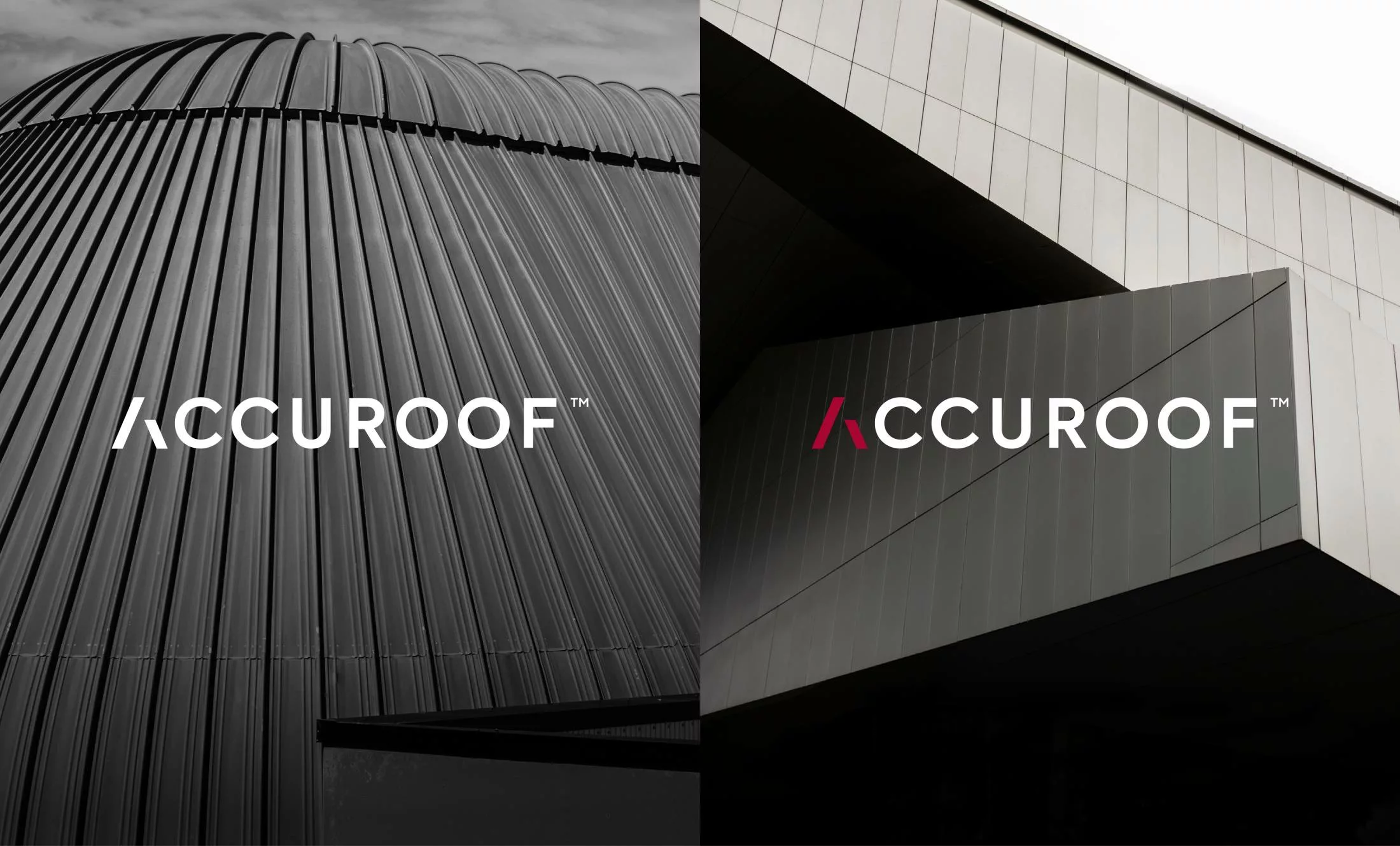
Thanks to our understanding of this audience and the challenges in the construction sector, our memorable rebrand to AccuRoof, and clever relaunch campaign, resonate strongly with architects. And we’ve given the AccuRoof team the tools to meet the needs of its audiences well into the future
Laying the groundwork:
research is key
research is key
OneAgency designed a short survey of 20 questions, distributed to the readership of Architecture Today. We wanted to test the ‘fame and favourability’ of the SIG D&T brand with architects and specifiers and uncover more about their motivators, pain points and what’s important to them when selecting suppliers.
From SIG Design &
Technology to AccuRoof
Technology to AccuRoof
With over 100 responses and 58% from architects with 21+ years’ experience, we had a relevant slice of opinion on which to base our thinking.
The research showed a perceived overlap between what SIG Roofing and SIG Design & Technology do. Furthermore, the word ‘Design’ didn’t align with what architects want – they are the designers, and they look to suppliers and manufacturers for detailed advice on materials.
When selecting a supplier, ‘product knowledge and product agnosticism’ was listed as the most important factor with 85% ranking it first or second. SIG D&T’s key selling point is that its advice on roofing systems is unbiased. And because this specialist advice is based on a broader range of materials, finding the right solution for a given project is more likely.
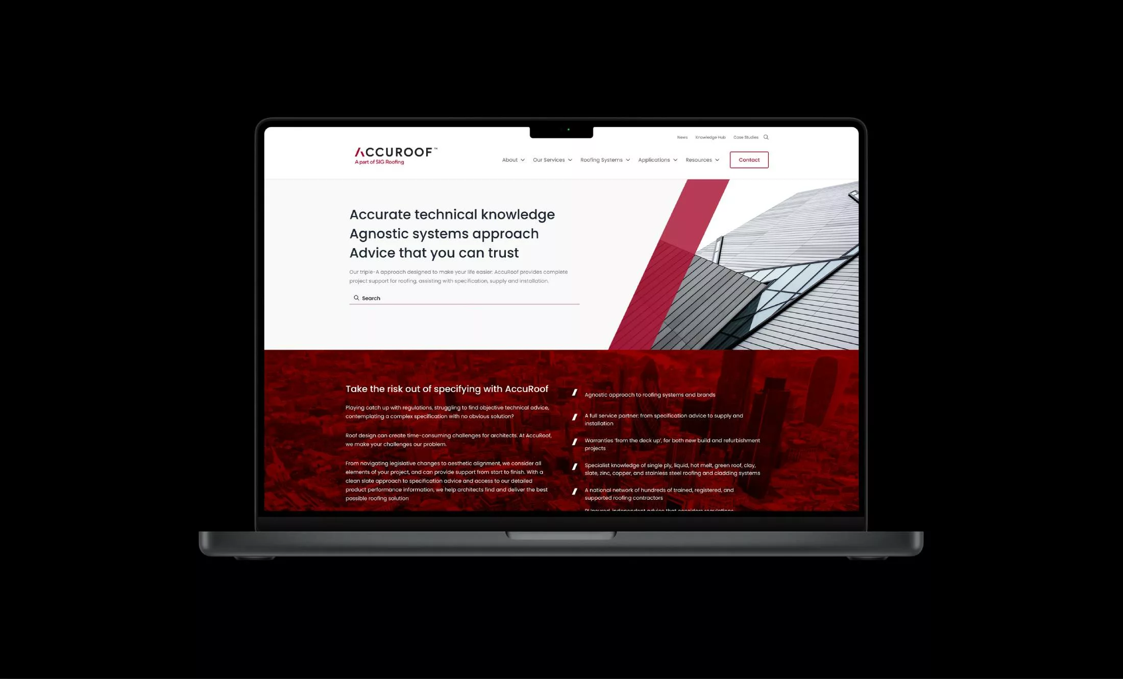
This ‘triple A approach’ of offering ‘accurate, agnostic advice’ distilled into the new name ‘AccuRoof’ and a reframed value proposition.

“The decision to rebrand has been strongly influenced by market research with key stakeholders, including architects, surveyors, and contractors, to better understand the areas they needed help with. For most of them, it was assistance with compliance and building legislation. The SIG Design & Technology model was already supporting this, but we felt it was time to really push the envelope and demonstrate our expertise within the industry.”
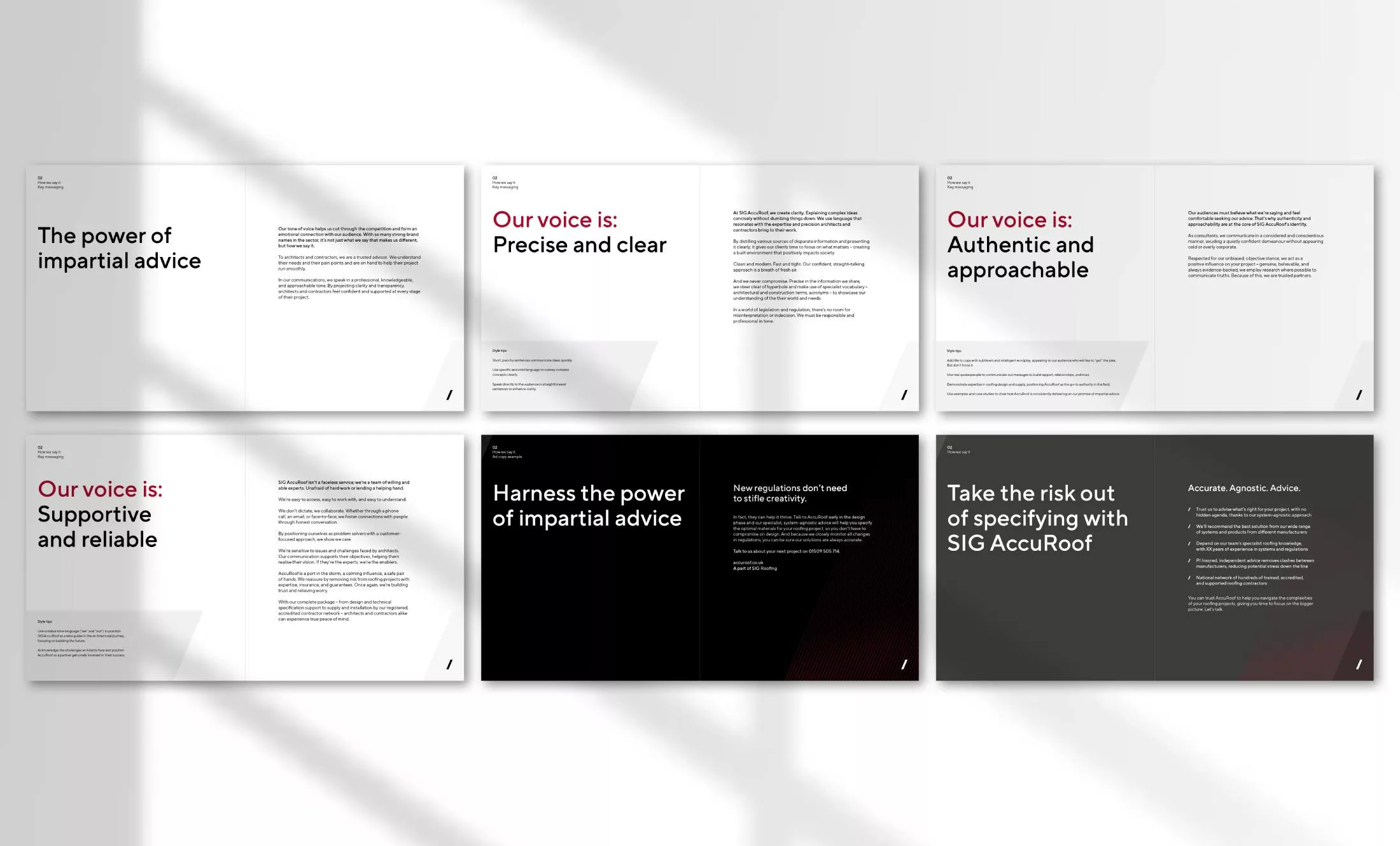
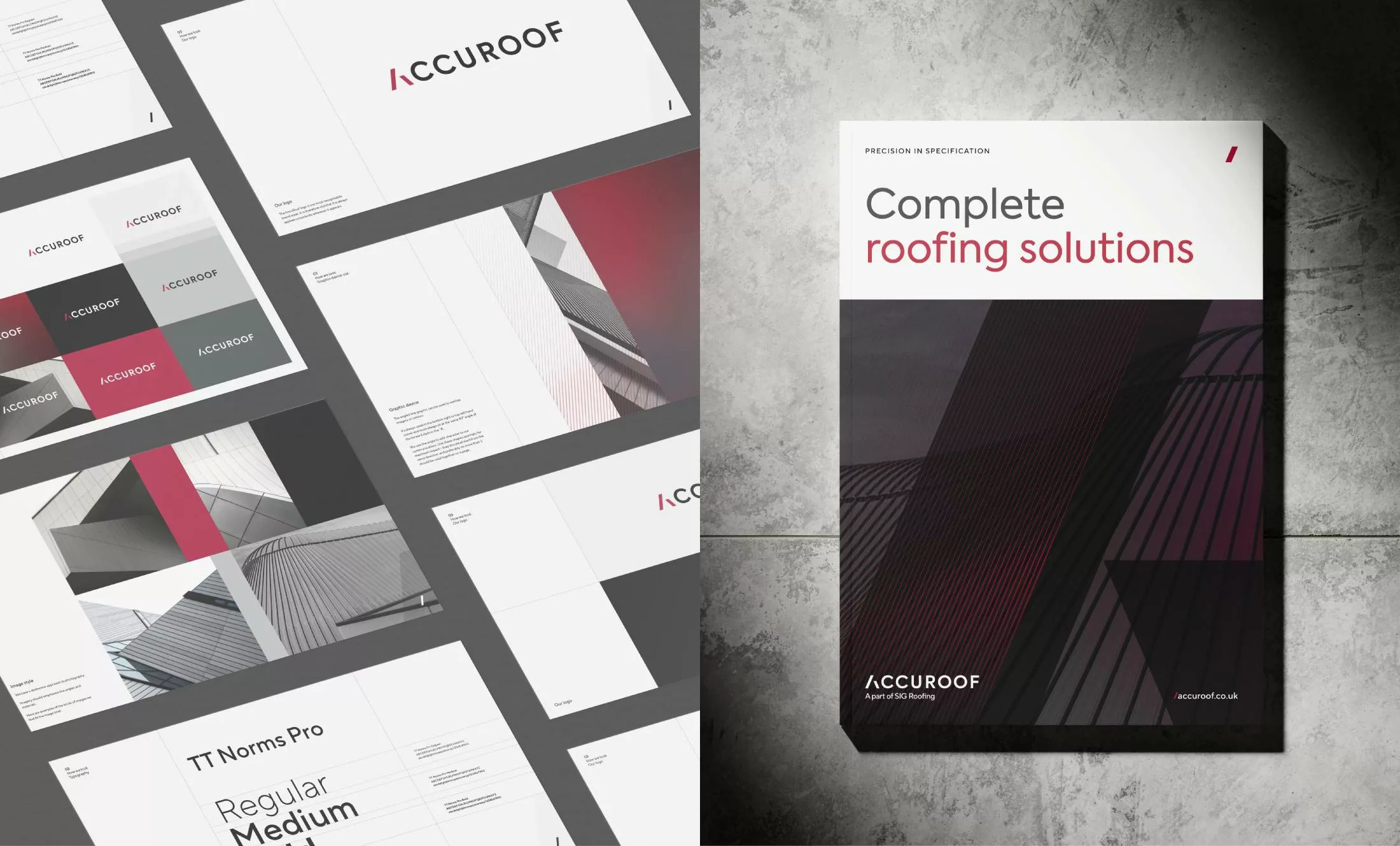
Brand book development
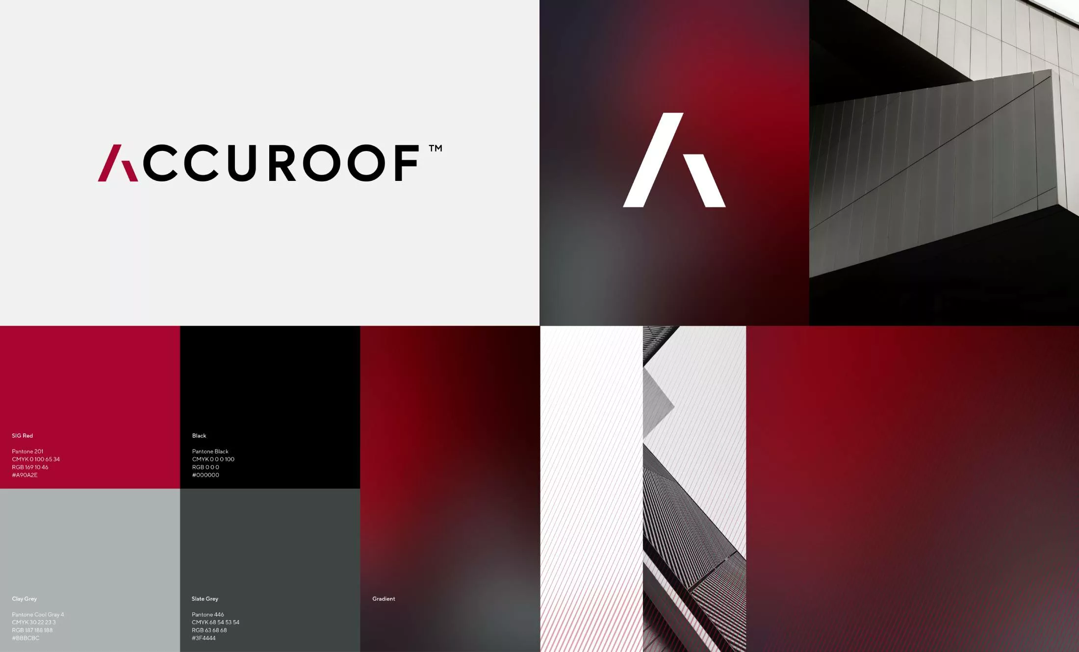
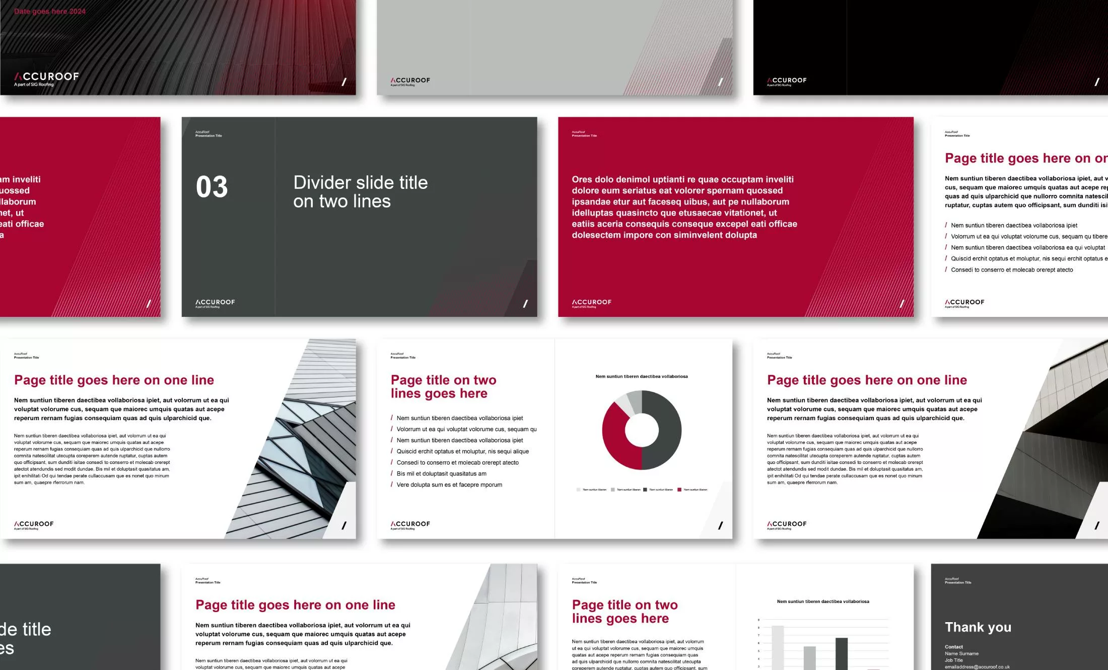
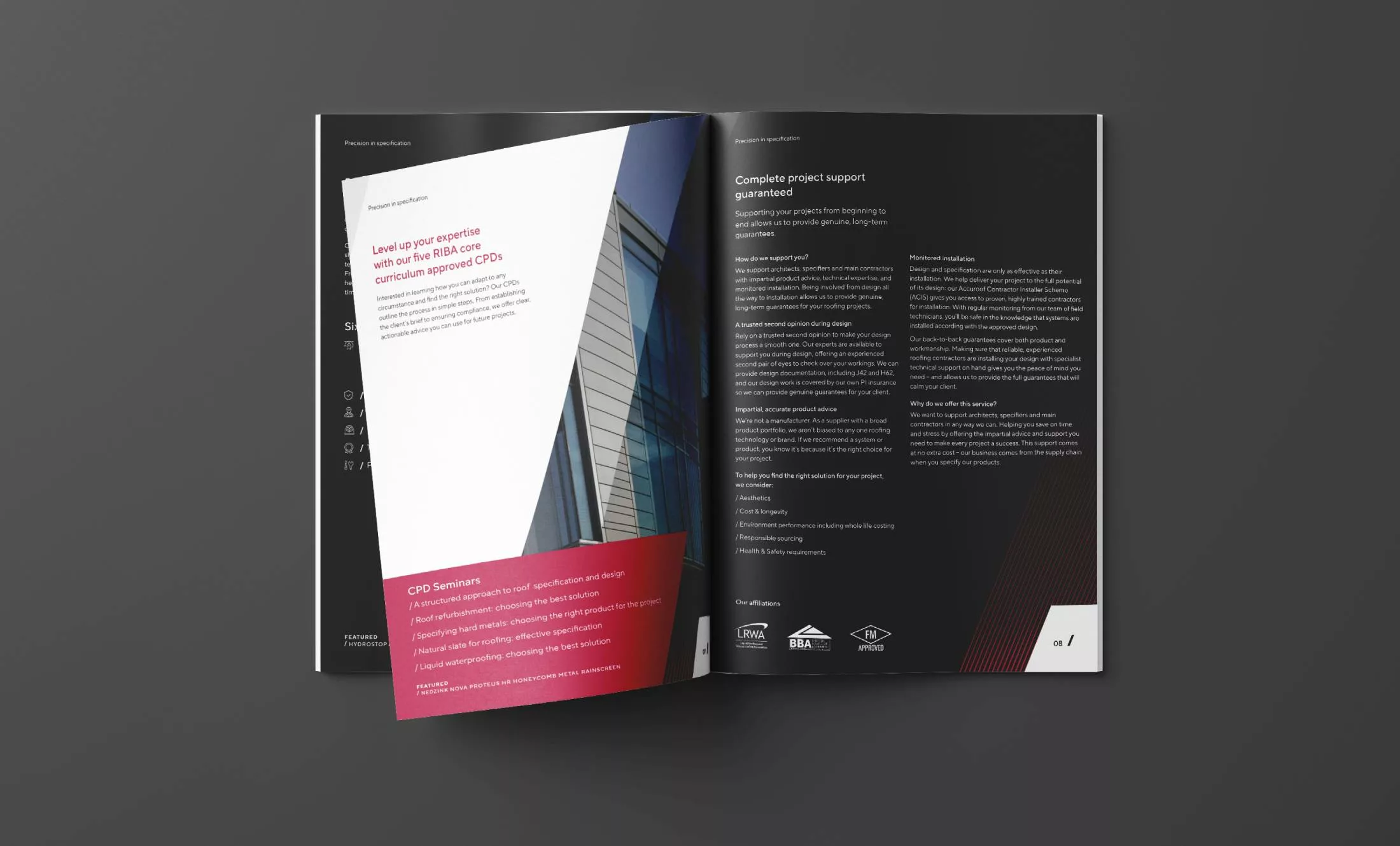
To appeal more to architects, we created a new visual style including a logo and graphical devices, alongside a refreshed tone of voice and copywriting guidelines – all bought together in a brand book.
Big idea born from research insights
The research gave us valuable insight into architects’ psyches, which led to a clear campaign idea for the launch creative materials.
Architects’ primary motivator is to design structures that positively impact people and society, but their top priority when starting a new project is compliance with regulations.
Creatively, our goal was to show how AccuRoof resolves this dichotomy. The creative brief became:
GET: Architects who, post-Grenfell, face changes in legislation that make meeting building regulations their top priority
TO: Seek specialist advice on materials at the start of their roofing projects
BY: Showing that only AccuRoof’s impartial advice and expert knowledge of roofing systems will help them find the optimal solution in terms of aesthetics and meeting regulations, so that they’re free to create.
A campaign as creative
as its audience
as its audience
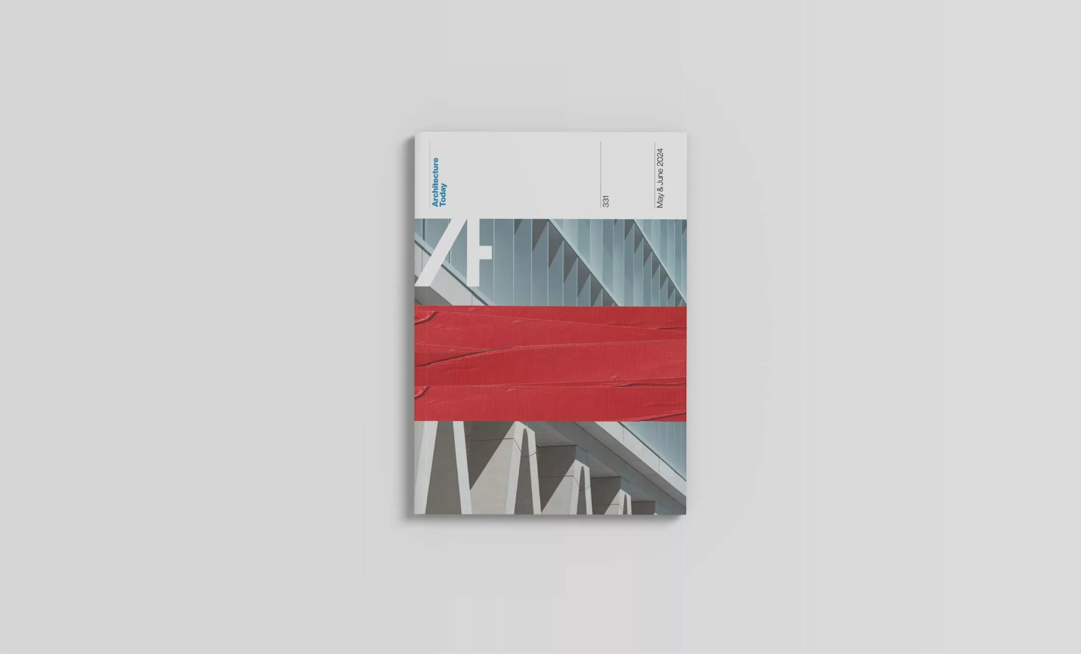
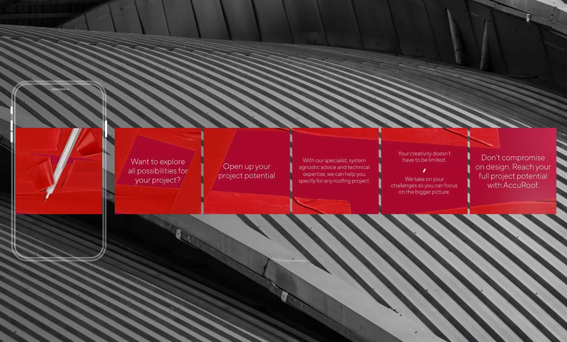
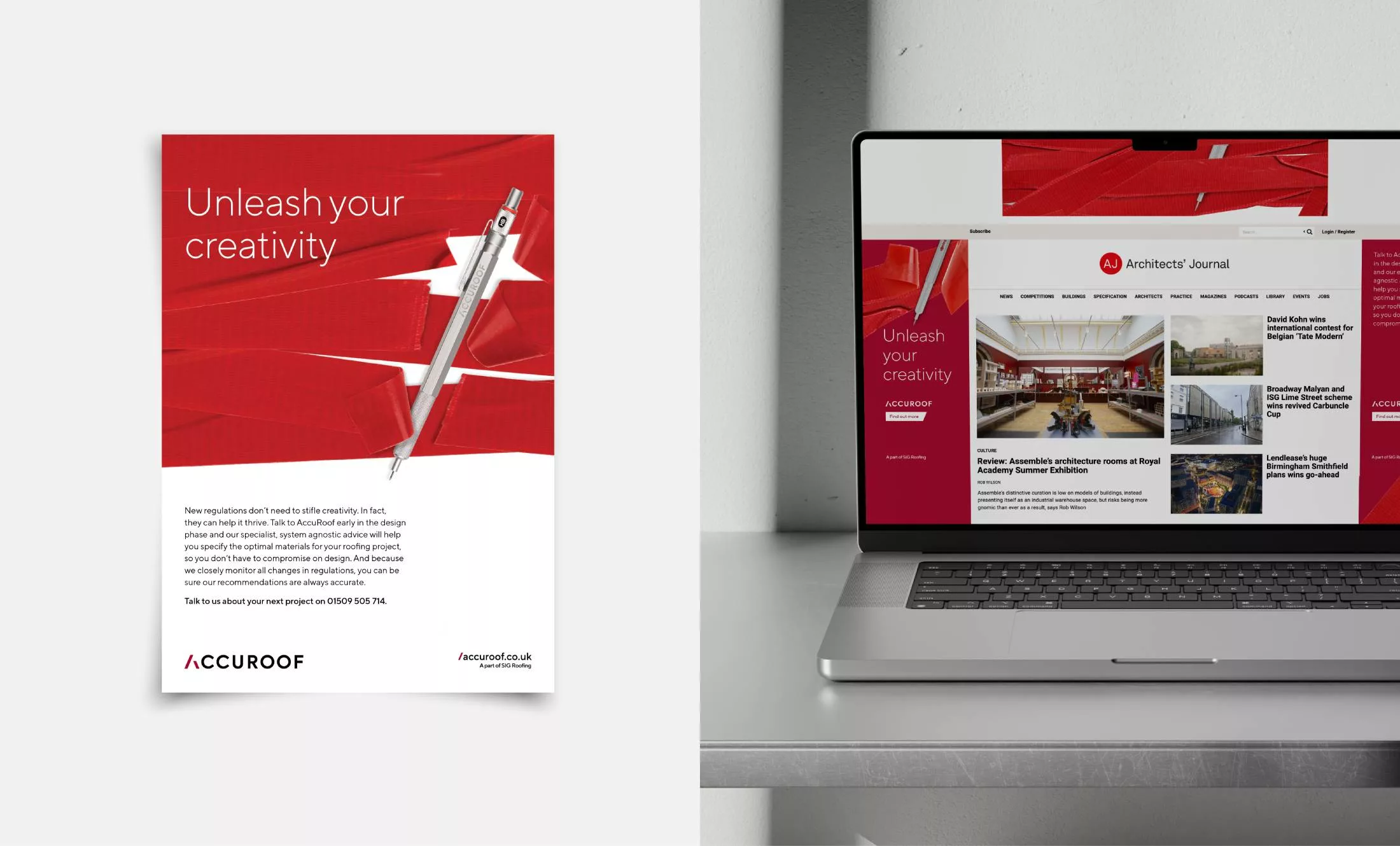
The central idea of the campaign became ‘Unleash your creativity’. Architects are intelligent and curious – they’re problem solvers. So, rather than spoon feed them, we want to trigger that curiosity and give them the satisfying experience of joining the dots and ‘getting’ the ad. To do this, our launch ad in Architecture Today used the media format to create a sense of intrigue before the campaign line and identity of the advertiser is revealed.
For the physical magazine we designed a bellyband purely of red tape – no copy, no logo. The contents of the magazine are literally contained in red tape. (An unbranded red tape newsletter banner was used for the digital version, creating a similar experience online.)
“Great client, brilliant agency, super creative idea! Magazine’s not bad either… thank you for including us in your plans.”
Multichannel launch
campaign
campaign
Together with researching and booking the media schedule, we boosted the launch with a targeted LinkedIn advertising campaign – a great value tactic to reach as many key people as possible. This worked well alongside an in-person launch event to solidify the AccuRoof brand in the minds of those who matter.

Direct mail
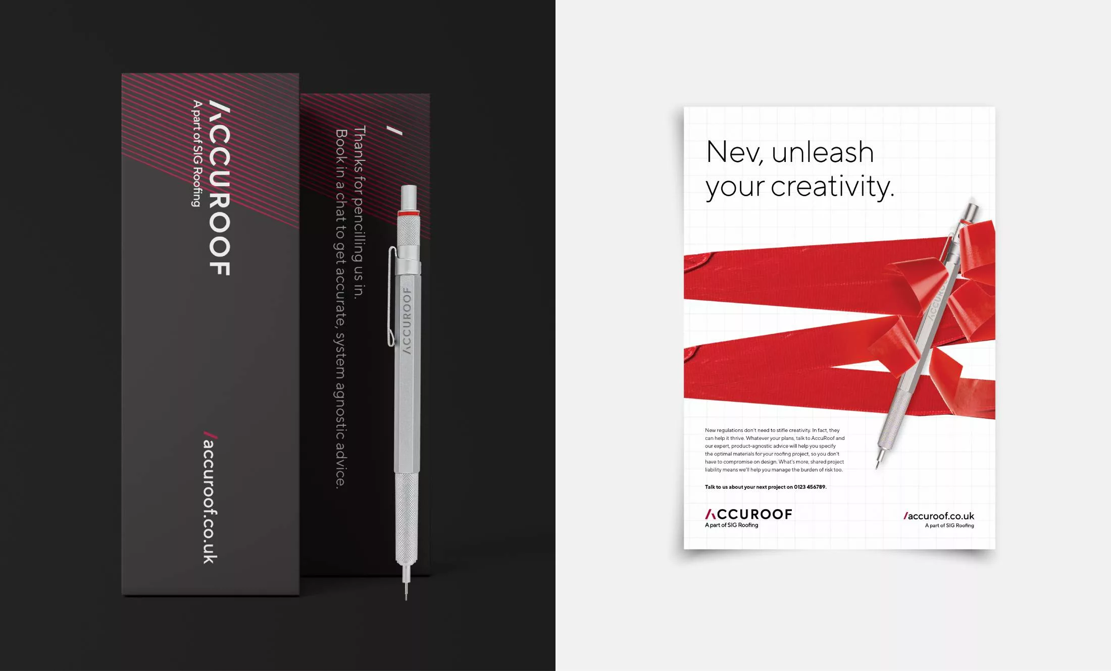
To create even more impact with tier 1 clients, we designed a mailer that takes the ‘unleashing’ idea to another level. An architect’s blueprint tube was sent out, bound in red tape and bearing an ‘urgent documents enclosed’ sticker. The ends of the tube are sealed to ensure that it takes some effort to release them – again to build tension.
Enclosed in the tube, a 2PP poster with a blueprint on the outside. On the inside is a poster version of the campaign message, personalised with the recipient’s name. The poster is wrapped around a foam insert, holding a Rotring pencil engraved with the AccuRoof logo. Not only are we symbolically giving architects an instrument of creativity, but also a beautifully designed object that doesn’t just cut through, but will be kept for years to come.
