Zip Residential
A cut above. Establishing a luxury brand.
View siteAs Zip’s fully integrated UK marketing partner for over a decade, for both B2B and B2C campaigns, OneAgency was briefed to support the brand in ‘relaunching’ its residential proposition. The goal? To establish HydroTap as the luxury choice in drinking water systems for the home.
Following some initial market research it became clear we are communicating to an extremely affluent consumer audience who have high expectations when it comes to a brand experience.
“One Agency is always quick to understand what’s required. With their excellent knowhow and approach, the team always delivers a high standard of work. The work for Zip’s residential range of filtered boiling, chilled and sparkling taps has attracted some fabulous new customers. The new lookbook, along with various other collateral, really has hit the spot and Zip has now secured an incredible share of the UK’s luxury home appliance sector. One Agency: A top quality agency for a top quality drinking water brand.”
Nick Taylor
Head of Residential, Zip Water UK
A refreshed look and feel
First impressions matter. The first interaction a potential customer has with a brand heavily informs their future actions. Cambridge University Press reported that consumers make decisions in as little as a third of a second. We are quick to judge! So, to make sure we resonate with an affluent customer, we know the experience has to feel luxurious from the first glance.
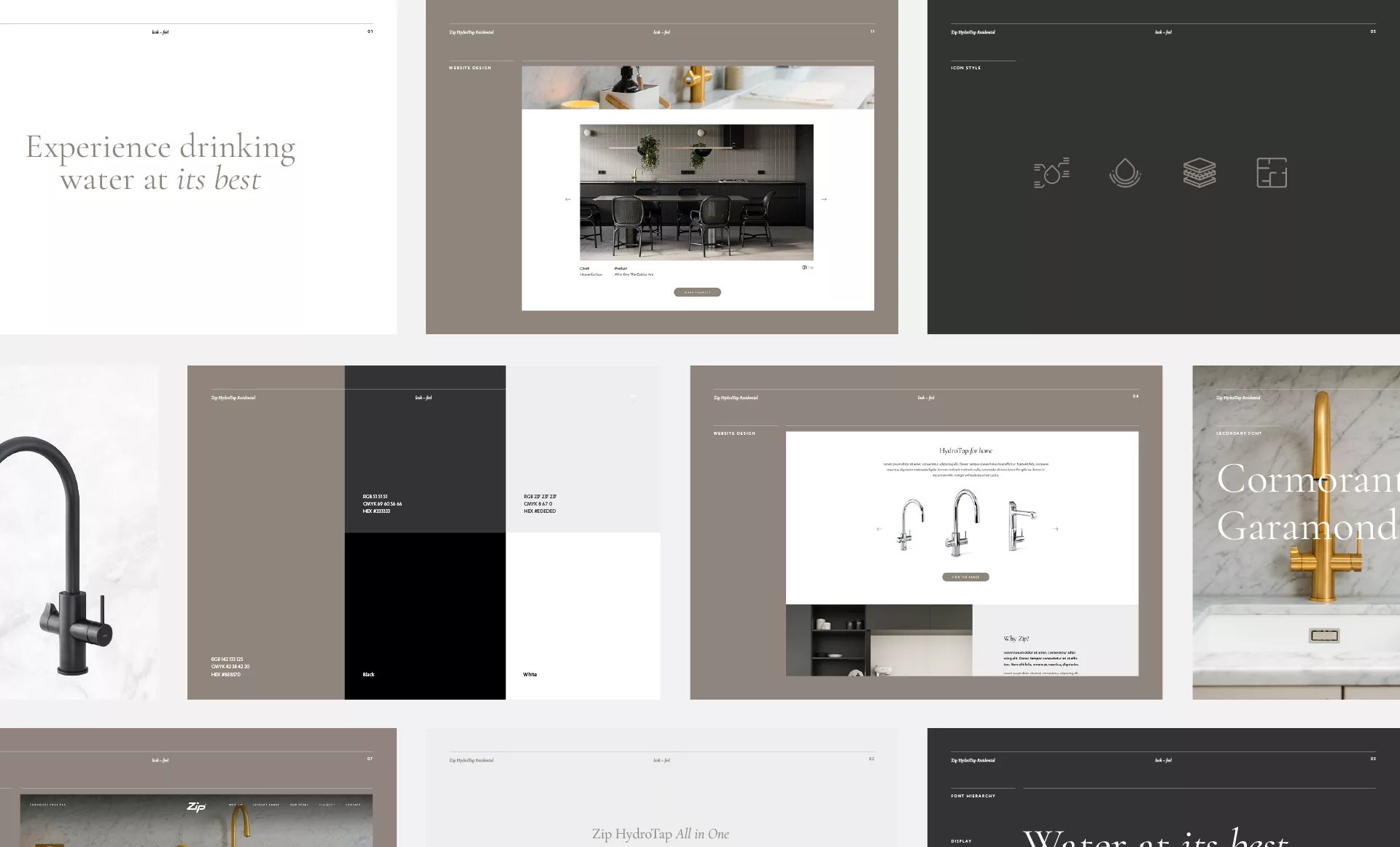
Task one was to review the visual identity of the brand. Fonts, imagery, colours, layouts, it all came under the microscope. Task two: create a new visual brand book.
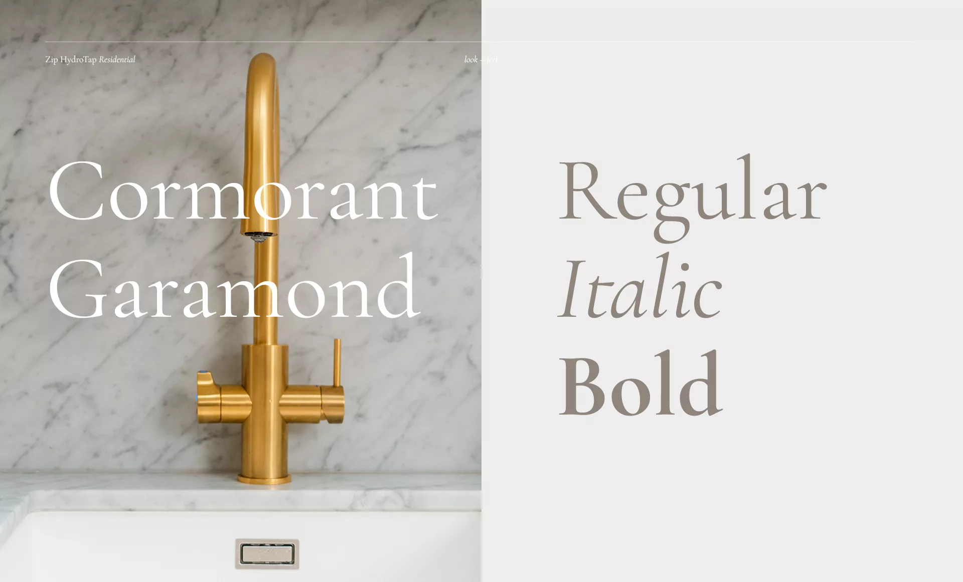
We proposed a new google font for header copy, a revised colour palette of soft grey tones and a style guide for upcoming photo and video shoots, all of which elevated the visual identity and tied it together in a luxurious silk bow.
With a fresh, concise and unique visual identity, the brand can consistently and boldly boast luxury from that all important first impression (all 0.3 seconds of it) to the customer experience beyond.
An injection of personality
As well as the visual identity, we all know words have a big impact on how a brand is perceived.
With a new residential tone of voice, Zip briefed the content team at OneAgency to work their wordsmith magic. The assignment was to apply the new tone of voice to various copy formats; website pages, articles and social media posts, to name a few, and ultimately inject energy and charisma.
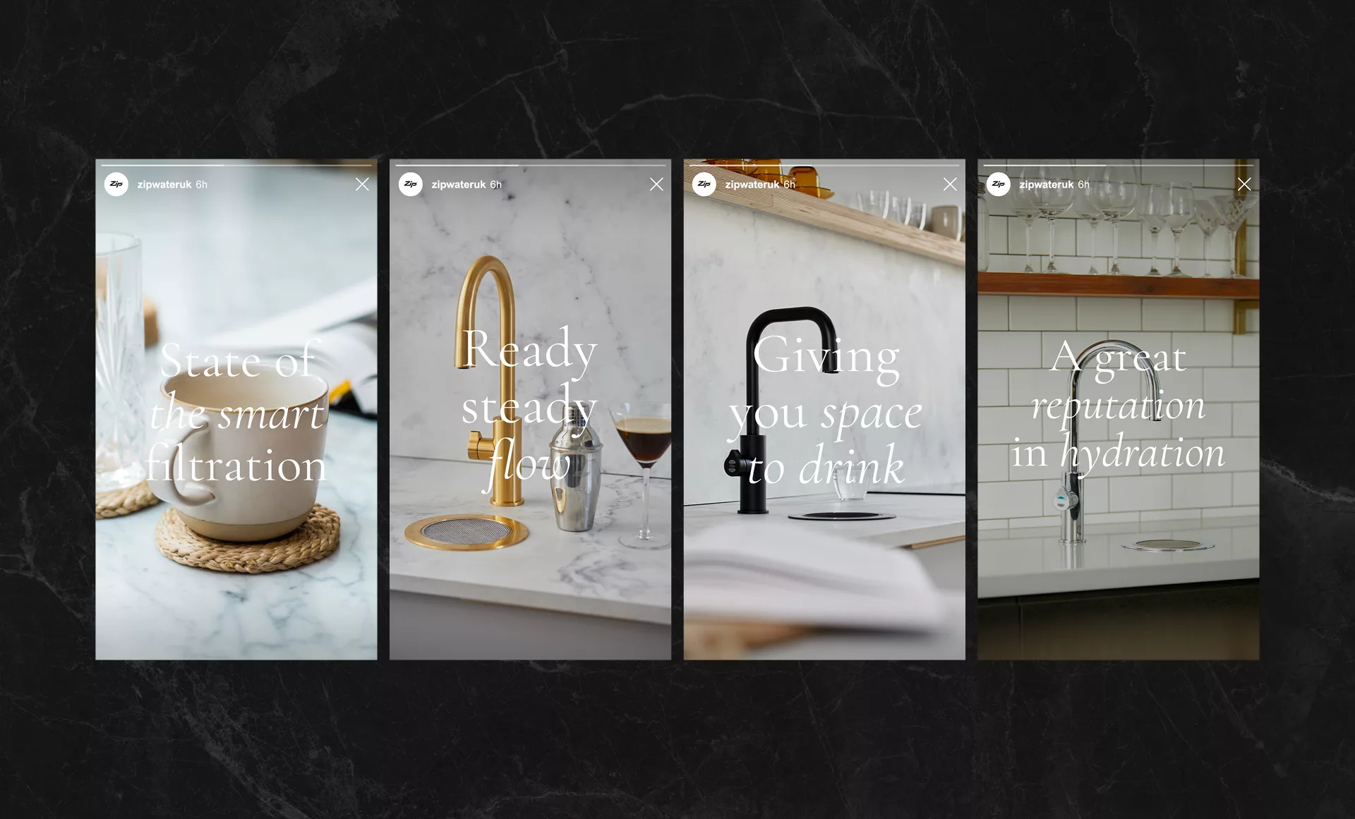
At every touchpoint, whether visiting the website, reading an email, scrolling Instagram or flipping through a brochure, the customer experiences consistent language affirming Zip’s high-end brand positioning. It’s unapologetic. It’s bold. It’s water at its best.
Additionally, as a brand that serves both B2B and B2C audiences the new tone of voice also plays an important role in differentiating the commercial and residential sides of the brand, giving ‘HydroTap for Home’ its own unique personality.
Boost vitality with video
Video has never been a more popular format. It is a fool-proof way to communicate your brand in an instant, and is effective across multiple channels.
Our videography department embarked on a number of shoots in high-end residential locations to generate a substantial library of beautifully aesthetic footage. From website banners to social media posts, the video content adds much needed movement to the brand’s digital presence.
With our in-house videography department, Zip was able to benefit from an incredibly cost efficient solution for capturing premium footage. We were able to take a small-scale shoot production and create a visually high-end output, thanks to clever cinematic tricks, attentive art direction and slick post-edit.
Harnessing the influencer network we’ve built over the past few years for Zip, the opulent homes from some of our ongoing partnerships provided the perfect backdrop to showcase the impressive HydroTap. Shoots included Malmo & Moss’ architecturally designed home renovation, House Curious’ elegant city townhouse and Slow Norfolk’s beautiful country homes.
Build wow with WIX
With a new creative brand identity, refreshed tone of voice and a beautiful suite of supporting visual content, it was time to pull it all together. An essential step in transforming the customer experience to one of splendour was creating a new digital destination to direct people to.
A website is, more often than not, the location of a customer’s first interaction with a brand. So for Zip, a website that oozes visual extravagance, alongside concisely communicating the brand narrative and capturing sales leads, was required. But, it also needed to be cost-effective and efficiently executed.
Our expert UX department, working collaboratively with our senior design team, devised a visually impactful yet technically simple solution.
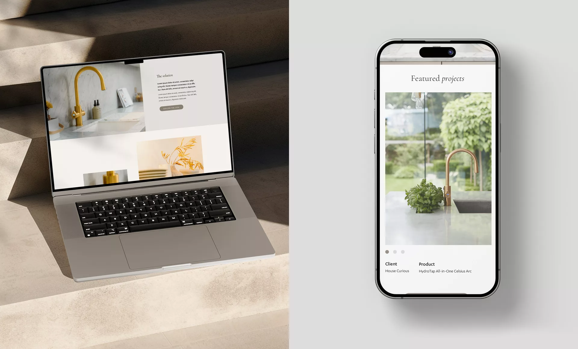
WIX was the chosen route, an end-to-end web creation platform that allows us to deliver visually aesthetic digital experiences for our clients without the need for complicated or costly code.
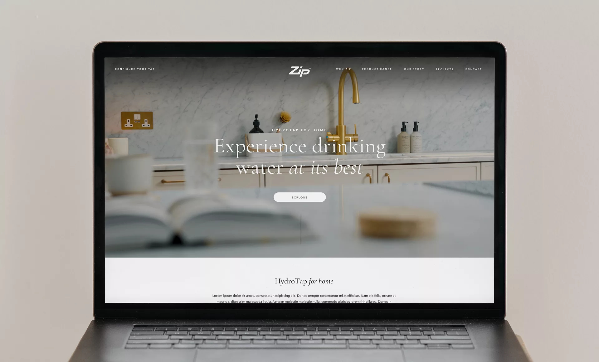
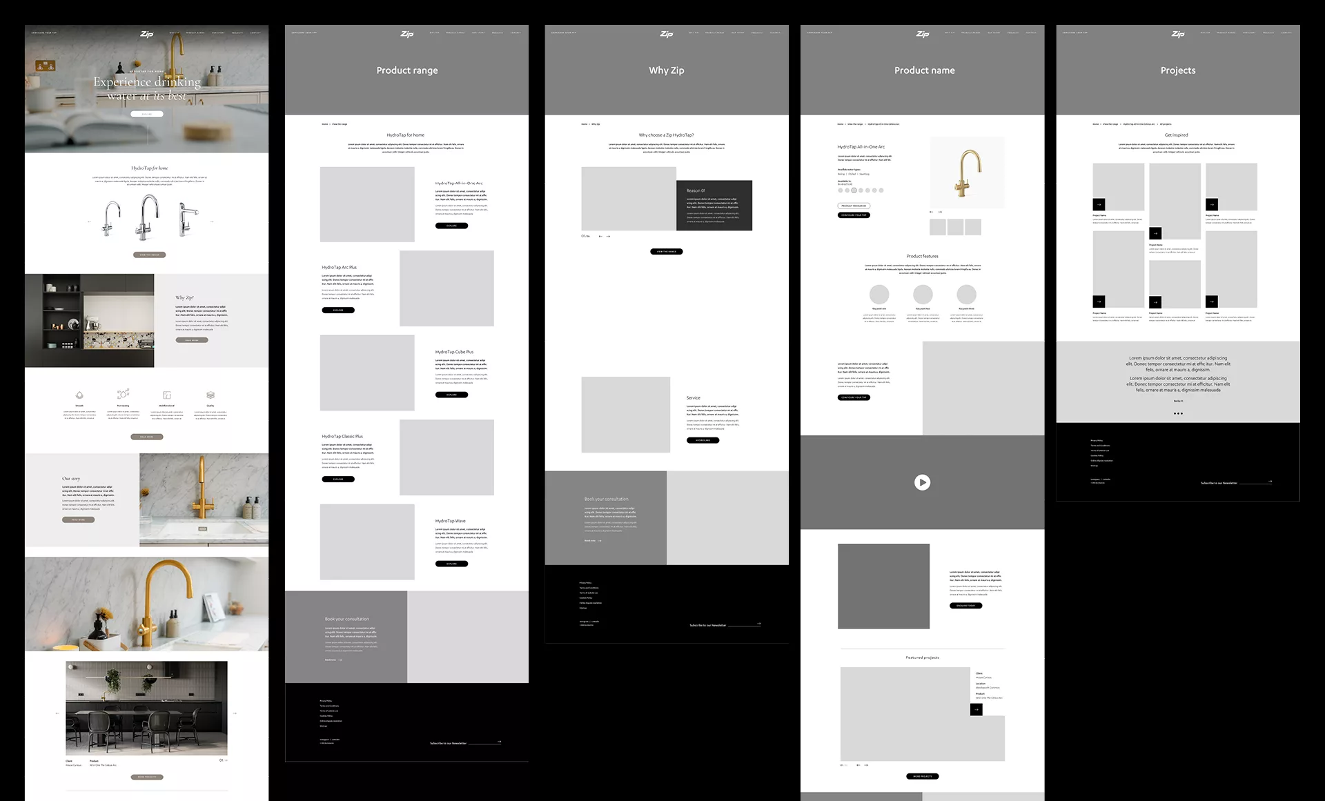
WIX allowed us to work quickly and dynamically. We were able to launch a highly visual 21-page microsite in just a few short weeks, including site mapping, wireframing, designing, copywriting and building.
The new dedicated residential site, with its beautifully curated video, imagery and words offers an elevated digital experience for customers, in keeping with the brand’s identity as the most luxurious drinking water system on the market.
Provide printed perfection
With a new dazzling digital destination in the bag, it was time to set our sights to the offline experience.
Though we now live firmly in a digital world, print is far from over. Often overlooked by brands, supplementary printed assets offer target consumers something tactile they can hold in their hands and engage with in a more considered way.
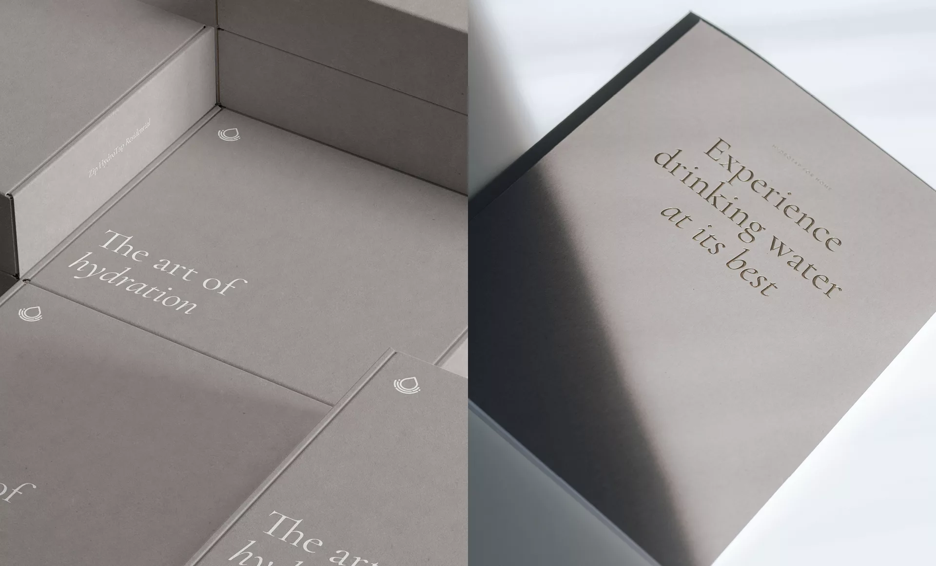
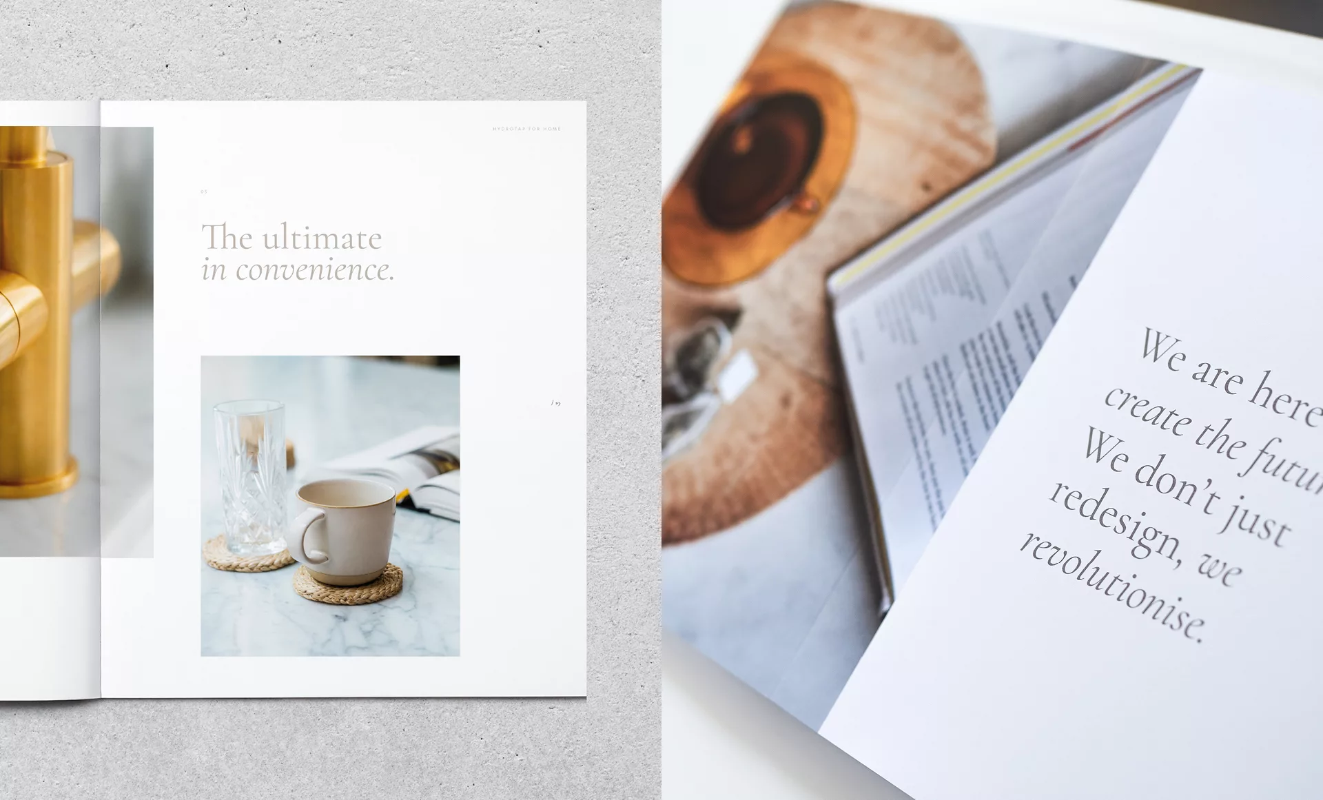
Our senior creative team relished an opportunity to design a beautiful piece of print, from pagination through to image selection, layout and typography decisions. We created the Zip lookbook. It showcases the very best of HydroTap with its editorial style of highly curated imagery and punchy, enticing headers.
We worked collaboratively with our network of local printers to devise a rich and lavish print specification. The stunning flay-lay brochure, printed on a sleek paper stock with gold foiling detail, provides customers 48 pages to pour over.
A fantastic asset for the sales team to take on the road, the look book will also be available to read in a number of high-end kitchen showrooms all over the UK.
Water at its best
Armed with its new identity, digital destination and a suite of visual assets, both on and offline, Zip Water is ready to approach its target market and begin to build a refreshed reputation as the luxury choice in drinking water systems for the home.
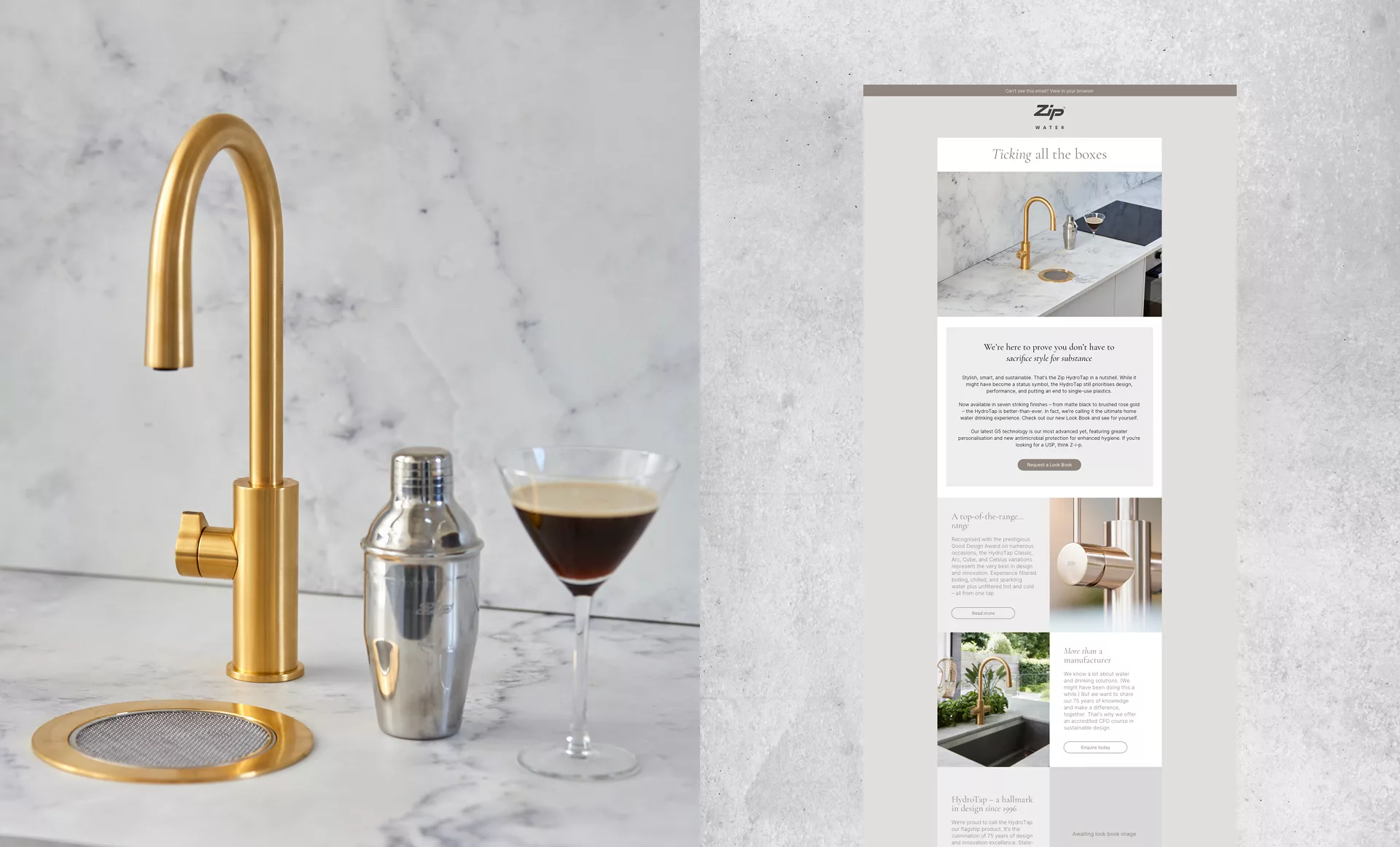
We are on hand to support, with an integrated marketing and communication strategy employing PPC and display advertising, paid social, email marketing, SEO content and PR.
